Future Knight LCD Art & Visual Style
Why the Game & Watch look is more than nostalgia.
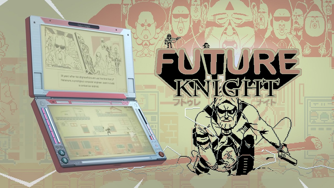
Future Knight sells itself on a liquid crystal aesthetic — bold outlines, limited palette motion, and ink-blot characters that feel like a premium Tiger handheld grew teeth. Studio Koba and Aeternum Game Studios are not chasing pixel-art nostalgia alone; they are translating pre-printed LCD constraints into a modern run-and-gun where readability still matters during bullet storms. This guide explains the visual identity so you know what you are buying before the August 13, 2026 launch.
Game & Watch DNA
Time Extension describes Future Knight as keeping the spirit of Nintendo’s Game & Watch line alive — single-screen clarity, high-contrast silhouettes, and animations that loop with mechanical charm. Unlike faux-retro filters, the art direction builds levels from that language: characters read instantly, hazards pop against dark backgrounds, and boss silhouettes telegraph phase shifts early.
ChuckNyce and other preview creators compare the look to Tiger LCD handhelds — a useful mental model if you grew up with fixed-screen toys. The difference is scope: Future Knight scrolls horizontally and vertically, adds physics gags, and layers M-rated humor on cute foundations.
Liquid crystal animation
Official marketing calls the technique liquid crystal pixel art — characters morph like ink spreading on a handheld screen. That is not cosmetic fluff:
- Hitboxes feel clearer when enemies use chunky silhouettes instead of noisy detail.
- Swap animations communicate form changes faster than UI icons alone.
- Environmental hazards (conveyor sushi, construction gear) use exaggerated motion readable at small Switch handheld sizes.
If you stream the game, expect chat to fixate on the aesthetic — plan overlays that do not cover the bottom dodge lane.
Satoshi Kon and 1993 Tokyo
Developers cite Satoshi Kon-influenced storytelling — surreal transitions, media satire, and reality bending without losing emotional stakes. The May 23, 1993 setting anchors cult parody in a recognizable bubble-era Tokyo. Read Story & Characters for narrative context; this page focuses on how art sells that tone.
Dark humor lands because cute LCD frames contrast with grotesque bosses — sentient waste piles and body-horror finales feel intentional, not random edge.
How visuals support combat
Art and mechanics intertwine:
| Visual cue | Gameplay meaning |
|---|---|
| Knight chrome plating | Stable firing platform phases |
| Two More stretch frames | Vertical or squeeze routes opening |
| Triangle glow | Collectible or gate — see Sectarian Triangles |
| Background parallax shift | Often precedes scroll-axis change |
When a phase suddenly desaturates or inverts, treat it like a mechanic tell — preview footage shows bosses using full-screen LCD flashes as pattern headers.
Platform presentation notes
All four launch platforms render the same art direction with different sharpness profiles:
- PC — highest clarity; good for learning telegraphs.
- Switch handheld — still readable thanks to thick outlines; see Platform Comparison.
- PS5 / Xbox — best on large displays for cinematic boss scale.
No platform changes the art style — only performance headroom.
Sound and UI cohesion
While this wiki focuses on visuals, the LCD fantasy extends to UI bleeps and chunky fonts. Audio telegraphs often sync with visual loops — listen during Boss Guide practice.
For content creators
Use high-contrast capture settings; crushing blacks hides telegraphs. YouTube thumbnails already lean neon — match that in edits. Credit Studio Koba when using trailer footage; fan wiki screenshots should stay fair-use descriptive.
Related reading
- Review — critical reception of the aesthetic
- Tips and Tricks — readability habits
- Official Links — trailers and press assets
Future Knight proves retro visual constraints can modernize bullet hell — not by hiding them behind shaders, but by making every blot on screen part of the combat language.
Frequently Asked Questions
Quick answers to the most common questions.
Is Future Knight pixel art?
It uses LCD-inspired liquid crystal animation — not classic 16-bit pixel tiles.
Does the art style affect difficulty?
Yes indirectly — clear silhouettes make patterns learnable once you stop over-shooting.
Who created the visual direction?
Studio Koba leads art; Aeternum co-develops. See Story & Characters for credits context.
Will there be accessibility filters?
Unconfirmed pre-launch — watch Patch Notes after release for any contrast options.